Brief
As part of my Usability Theory and Practice study at Pratt, four classmates and I teamed up and conducted this user research focused around the Brooklyn Historical Society (BHS) website. Ten participants who were familiar with BHS and/or interested in the history of Brooklyn were recruited and completed a series of tasks and questionnaires. After all testing was complete, the results were reviewed and recommendations for potential usability problem areas were provided.
Three major themes of usability issues were identified:
- Content pages have flat information hierarchy, are text-heavy, and lack interesting visual elements
- Navigation bars on both the BHS website and the Online Image Gallery page lack contrast and contain labels (for example, ‘Public History’) that are not user friendly
- The deep navigation menu on the BHS website often lead to participant frustration and confusion
To address the usability issues we make the following recommendations:
- Reduce the amount of text and add visual elements to the Search the Collections Page
- Improve the visibility of the Online Image Gallery navigation bar and search features
- Reorganize the Membership page for clarity and add visual elements
- Condense the Public Program Page and add an analog calendar
- Simplify and rearrange the left navigation menu and conduct further research
Introduction
The Brooklyn Historical Society (BHS) was founded in 1863, and is dedicated to preserving the
long and rich history of Brooklyn. The institution has two locations: the main location on
Pierrepont Street and the newer location on the waterfront in DUMBO. BHS hosts a variety of
events throughout the year and display exhibitions on a variety of subjects and items from their
collections. The BHS appeals to and serves a wide audience, from historical researchers to
tourists from around the world. The library and archives house thousands of documents, photos,
maps, and other materials related Brooklyn’s history. The website, brooklynhistory.org, is a
gateway for users to learn about and engage with BHS.
In order to insure the website is usable and provides a positive experience for the BHS’s large
audience, five graduate students at the Pratt Institute’s School of Information conducted inperson usability testing. Before testing, the evaluators met with Julie May and Marcia Ely from
BHS to discuss their thoughts on the website, and what the kind of user behaviors/thoughts they
were interested in learning more about.
The evaluators developed a set of parameters for choosing potential study participants and
recruited via online survey and an in-person visit to the BHS Dumbo location. Ten people were
chosen to participate in the study with each receiving a $10 MetroCard as compensation. The
participants completed three tasks, a series of questions, and the Usefulness, Satisfaction, and
Ease of use Questionnaire.
Based on the usability issues experienced by study participants, the researchers identified three
major usability problem themes and developed several recommendations. With these
recommendations, the user experience and overall usability of the website should improve.
Methodology
USER TESTING DESCRIPTION
To better understand how individuals interact with the Brooklyn Historical Society website (brooklynhistory.org) we employed the usability testing method of in-person user testing. For inperson user testing, study participants are generally given a set of predetermined tasks,
surveys, and questions to complete. Study participants are instructed to ‘think-aloud’ while
completing the tasks (Nielsen, 2012), and are recorded using screen, audio, and face recording
software/equipment. Some drawback associated with in-person testing include (potentially)
high costs and the potential for the observer effect to occur. The observer effect refers to the
phenomena in which participants modify their behavior as a result of or an awareness to being
observed (Editorial Team, 2018). However, in-person user testing is an extremely beneficial
method because not only are we obtaining data from real-world users of the BHS website, but
by also having users complete the study in-person we are able to gain additional insights into
their behaviors and feelings by asking questions while they complete tasks (Aerts, n.d.).
PARTICIPANTS
In our application of user-testing, we recruited participants by sending out an electronic recruitment survey and by distributing paper-version of the survey at an event at the BHS Dumbo location (see Appendix 1: Participant Recruitment Surveys for both forms). The recruitment surveys generated a pool of 24 potential study participants. Due to the limitations of the study, we were only able to provide compensation for 10 participants and thus had to limit our sample (see Appendix 4: Participant Description Form). Additionally, only participants that had expressed interest in the history of Brooklyn and provided contact information were included in the final sample of participants. The majority of participants completed the study at the Pratt Manhattan Campus; the remaining participants were tested at the BHS’s Dumbo location.
TESTING PROTOCOL
In order to test a wide range of features on the BHS website, we developed a study protocol that consisted of a set of questions, 3 tasks, and the Usefulness, Satisfaction, and Ease of use (USE) Questionnaire that was developed by Lund (2001). Pre-test questions were chosen to gather general information about the user and their prior experience with the BHS and the website. The participants were then given the following three tasks to complete:
Following each task participants were asked a few questions to assess the usability of the website using a shortened version of the Single Ease Question (SEQ; Sauro, 2012) as well as a few other more descriptive questions addressing the user’s feeling/thoughts about the website in relation to each task. Once all the tasks are complete, participants were asked to complete the USE Questionnaire which assess usability, ease of use, ease of learning, and satisfaction of the website as a whole (Lund, 2001). Some examples of the USE items can be seen in Figure A; a full list of USE items is available in Appendix 3: USE Questionnaire. Each item is rated by the user on a 5-point Likert scale from strongly disagree to strongly agree. Finally, users are asked some post-test questions that address the user’s impressions about BHS and the website. A full list of all questions and USE Questionnaire items can be found in Appendix 2: Study Questions.

Results
SUMMARY
Overall, participants had a very positive reaction to BHS and the website. Some participant comments include: “Having grown up in Brooklyn, a place like the BHS is really important to me”, “I love it [BHS], you can always find great programs and exhibitions”, and “It really seems like they’re trying to build a solid community, they really care about their members.” Several participants also enjoyed the visual design and aesthetics of the website. One participant said, “I like the homepage. It’s fairly aesthetically pleasing.”. Others gave praise to specific aspects of the design such as the logo, graphics, and usage of color. Results from the USE Questionnaire revealed that participants rated the website as very easy to learn to use (average rating of 4.25) and as having good usability (average rating of 3.7) and was fairly easy to use (average rating of 3.6). For a full report on both the USE Questionnaire and the user testing sections refer to Appendix 5: Research Data Spreadsheets. As for a general summary of the tasks results:
Task 1: All participants were able to complete the first task fairly quickly and with no errors. Participants rated this task as being ‘very easy’ and that the website was very helpful to them when attempting this task. Additionally, participants commented that the labels were clear, and that the navigation path was very straightforward and simple.
Task 2: All participants were able to complete the second task. However, due to confusion about the navigation label ‘join & support’ and differences about the various membership levels, this task took longer for participants to complete. Several participants felt that the join & support label is somewhat unintuitive, with one participant saying, “I feel it would be more straightforward if they said membership”.
Task 3: Four out of ten users were unable to complete this task. While most participants easily and successfully navigated to the ‘Search the Collections’ page, from this point on participants had a more difficult time. Once on the ‘Search the Collections page, participants were overwhelmed by the flat information hierarchy and large amount of text. One participant remarked, “Everything just blurs together, it doesn’t look nice, and I scrolled past where I was supposed to click”. After participants found the Online Image Gallery, their difficulties focused around locating and using the search feature. Several participants didn’t notice the top navigation and found both the keyword and advanced searches to be unintuitive.
Taking all the data together, we identified 3 major issues:
In the next section, we provide more in-depth problem descriptions and page-specific recommendations on how these usability issues could be addressed.
Problem Descriptions & Recommendations
RECOMMENDATION 1:
REDUCE THE AMOUNT OF TEXT AND ADD VISUAL ELEMENTS TO THE SEARCH COLLECTIONS PAGE
Problem Description
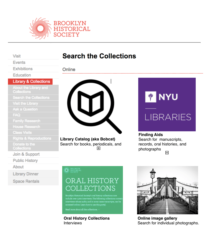
In order to complete task 3 (find an image of a coffee shop from the 1960’s) participants needed to locate and use the BHS’s Online Image Gallery. Four out of ten participants failed to complete the task and all participants reported they’d experienced a lot of difficulties finishing the task. When they landed on the ‘Search the Collections’ page, many were overwhelmed by the large amount of text, and felt that all the catalogs were “cluttered” together (see Figure 1.1).

Participant 10 scrolled right past the ‘Online Image Gallery’ link without actually noticing it, and ended up being unable to complete the task. Afterwards, that same participant mentioned, “Everything just blurs together, it doesn’t look nice, and I scrolled past where I was supposed to click”. Five out of ten participants explicitly reported that there were too much text in the descriptions under each catalog heading and would prefer some visual elements instead. Participant on said, “Having visual things that people can immediately relate to would help draw people in”.
Recommendation
Based on these findings we have recommended a few changes to make each online catalog available more noticeable, the function of each catalog clearer, and the webpage have a more “modern” design. Instead of the text-heavy list the website has at the moment, we’d like to make it more graphic-focused. Each catalog will be assigned a picture as visual support with a one-line text description (see Figure 1.2). Additionally, users could click each image for more information about the particular catalog. The intention is that users will have an idea of what the catalog is about without the page getting too cluttered with lengthy descriptions. The catalogs will be presented in a blog posts/portfolio style that is both visually interesting and familiar to users that have experience with websites of similar organizations.
RECOMMENDATION 2:
IMPROVE THE VISIBILITY OF THE ONLINE IMAGE GALLERY NAVIGATION BAR AND SEARCH FEATURES
Problem Description
As mentioned in Problems and Recommendations 1: Search the Collections Page, task 3
required participants to use the Online Image Gallery to find a particular image. However,
several users were unsuccessful with one commenting “It’s [task 3] really difficult”. According to
the usability test results, we found that participants were struggling with the search functions
on the Online Image Gallery page. Four of the participants completely missed the search
functions at first, and remarked “Where is the actual button to search?”, “Oh ‘keyword search’, I
didn’t see it up there”, and “Where is the search box?”. On the Online Image Gallery page, the
actual search bar doesn’t appear until you go to the “keyword search” page, one user stated “It’s
very inconvenient”. Three participants questioned the accuracy of the search results and one
participant was particularly frustrated by having to click back and forth between the search
results page and the individual images. Based on researcher observations and participant
comments, the main problems with the search feature include: low visibility of the navigation
bar, lack of a direct way to search on the Online Image Gallery homepage, and redundant label
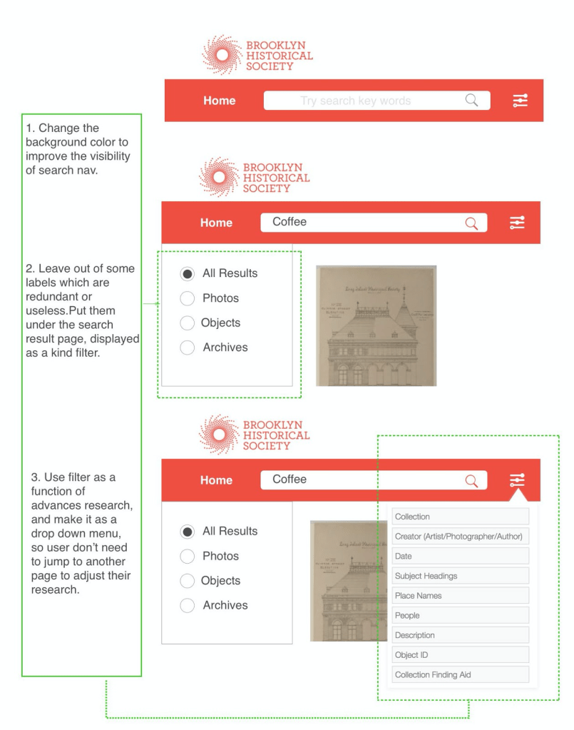
search features (Figure 2.1).

Recommendations
To address these usability issues we recommend first, using red instead of grey for the background color. This will increase the color contrast and thus improve the visibility of the navigation feature. Second, provide a search bar instead of links to a separate search pages. The search bar is more visually distinct in terms of both the functionality and visibility. It’s a common feature across websites which most users are familiar with and know how to use. This would reduce the amount of time users would need to spend searching for and learning how to with the Online Image Gallery collection. Finally, provide easily accessible search filters instead of labels. Labels such as “archives”,”Photos”, and ”Objects” are considered as different categories of search results, which may be confusing to users. These labels could instead be organized as filter options, so people do not need to read through every single label to see if their search query matches the demands of the catalog search but they are still available for use if necessary (see figure 2.2).
RECOMMENDATION 3:
REORGANIZE THE MEMBERSHIP PAGE FOR CLARITY AND ADD VISUAL ELEMENTS
Problem Description
In Task 2, participants were asked to learn about what membership options are available and to
choose one that will give them early access to exhibits and free or discounted admission for
themselves and their family. All participants completed the task successfully and quickly.
However, similarly to the issues seen on the ‘Search the Collections’ page, seven out of ten
participants felt that there was too much text. Participant comments about this page included
“everything is cluttered together” and “requires some digging”.

At the moment, the membership page has grouped the different memberships by the benefits members will receive. This is becomes an issue specifically for 3 kinds of memberships in particular: Students/Teachers/Seniors, BHS Friends, and Family/Partners (Figure 5). Despite each type of membership having different names, various costs, and slightly different benefits they are still listed very close together and as if they are all in one category. This has proved to be very confusing for many participants. Because everything is listed together with a long text description, users could become confused or impatient while attempting to figure out the benefits of the different kinds of memberships (see figure 3.1).
Recommendation
We recommend introducing more whitespace, highlighting the name of each membership options; reducing the long descriptions into short declarative lists. Besides, we recommend starting the page by introducing the “Core Benefits”, which would be the benefits of Students/ Teachers/Seniors, BHS Friends, and Family/Partners. Then introduce each membership options with their unique and plus benefits. This will minimize the amount of text on the membership homepage and made users easier to navigate and target the membership that fits them them most (see figure 3.2).

RECOMMENDATION 4:
CONDENSE THE PUBLIC PROGRAM PAGE AND ADD AN ANALOG CALENDAR
Problem Description
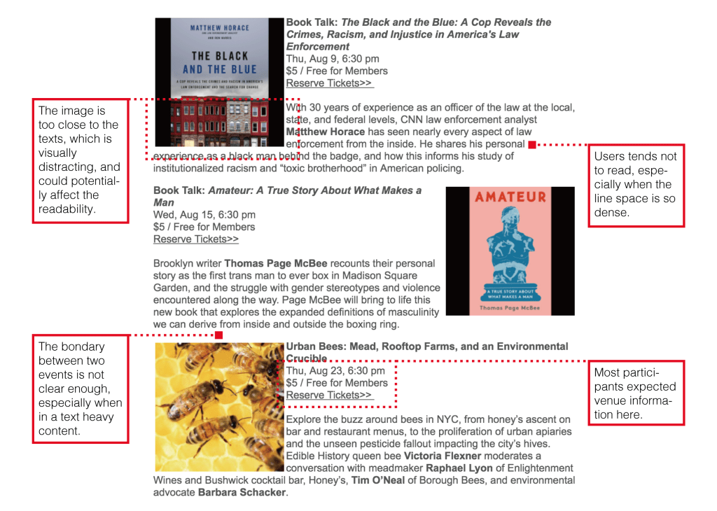
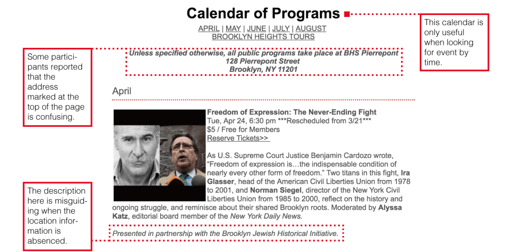
To complete task 1, participants needed to use the ‘Public Programs’ page to find information about a specific event. Although all users were able to find this page and the event quickly and mostly with ease, several participants disliked the fact that events were only available in chronological order and as a static list. Two participants went on to mention that had they needed to search for events that were several months away or solely by topic, it would’ve been frustrating to scroll so much. Another problem participants encountered was the placement of the event location information. Most thought that it was confusing to separately list the location information at the top of the page instead of with the event (see figure 4.1). As one participant said, “location should be listed along with event name and ticket price.” Finally, as with the other content pages, the relatively flat information hierarchy may introduce additional problems for some users (see figure 4.2).
Recommendations
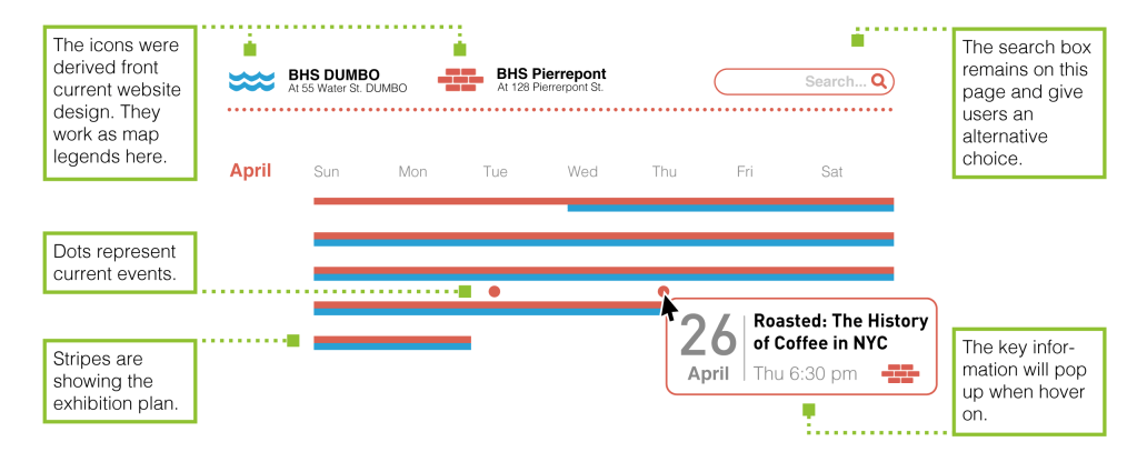
In order to resolve the problems mentioned, the researchers recommend converting the public program page from a list of events into a searchable index. This will give users the ability to browse it easily without being distracted by the long and detailed descriptions. The index should only include the title, time, and venue of the event. This will reduce the amount of text on the ‘Public Programs’ page and if users want to learn more about a particular event they only need to click the title that links to an independent page for additional information (figure 4.3).

Currently, the calendar on the top of the public program page is lacking in both visual interest and functionality. To improve upon both of these aspects, we suggest that it should be transformed into an analog calendar. The calendar should include highlighted marks of both exhibitions and events, which can be activated by hovering (figure 4.4). A filter that helps user search for events/exhibitions based on specific BHS location is also recommended. This new calendar should help address the concerns brought up by the participants and researchers.
RECOMMENDATION 5:
SIMPLIFY AND REARRANGE THE LEFT NAVIGATION MENU, INCREASE THE CONTRAST OF THE SUBHEADING BOXES AND CONDUCT FURTHER RESEARCH
Problem Description

All participants have more or less critiqued the left navigation menu. In short, they thought the navigation bar was ponderous and confusing. More than one participants have reported they were confused by the subheadings of the left navigation menu. As user 4 has commented, “When I click on the ‘visit’, I expected it will goes to another page instead of many subheadings.” What’s more, the subheadings were narrated in white texts on a grey background. It has been pointed out by two out of ten users that the contrast was too low and it’s hard for them to read. In addition, the headings weren’t labeled properly. In the Post-test Questionnaire, participants were requested to guess what the heading “‘Public History” was standing for, and nine out of ten users have reported that they didn’t expect to find the projects BHS had done. Similarly, although controversial, it is worth mentioning that the “membership” heading were expected by half of the participants to be include in the menu’s top level (see figure 5.1).
Recommendations
Problems regarding the left navigation menu are in different aspects. Firstly, The experts have recommended that the subtitles should be call out by hover, instead of clicking. However, it still needs to remain clicking call-out when doing mobile-device adaptation. Secondly, we recommend to increase the subheading dropdown’s color contrast, especially considering there is a great portion of BHS’s audience are elders. In order to distinguish the subheading boxes from their parent headings, we suggest to enhance the subheading box’s contrast (see figure 5.2). Thirdly, the label “Public History” should be changed into “BHS History Projects”, and the membership subheading should be pull out from “Join and Support” to the first level of the menu.

However, it is worth mentioning that the logic behind a navigation menu structure is usually complicated and it usually requires a specific research, so the experts suggest that after reconstructing the left navigation menu, a Tree Test (which evaluates a hierarchical category structure, or tree, by having users find the locations in the tree where specific tasks can be completed, Whitenton, 2017). should be accomplished accordingly and a further revision should be expected.
Conclusion
Most of our participants were able to complete the assigned tasks, though the final task proved the most difficult with four participants being unable to complete it. Despite this, the feedback from all ten participants’ experiences using the website yielded valuable information and insights into how users interact with the BHS website.
We developed 5 recommendations to improve the usability and provide a more positive user experience of the BHS website:

Overall, the Brooklyn Historical Society’s website contains a wealth of information about the history of Brooklyn and the institution itself. However, as identified by our research, the current website is not the easiest for visitors to navigate and use. While some of the information proved easy to find, text-heavy pages and lack of visual elements made some tasks more difficult for some participants. It is our hope that through implementation of the previously mentioned design recommendations that the website will provide an excellent user experience for both new and returning users.
References
Aerts, E. (n.d.). User testing: What, why, and how?
Brooklyn Historical Society. (n.d.). About Brooklyn Historical Society.
Editorial Team. (2018, February 22). Hawthorne effect | What is it? A detailed guide.
Lund, A. M. (2001). Measuring usability with the USE questionnaire. STC usability SIG newsletter.
Nielsen, J. (January, 2012). Thinking Aloud: The #1 usability tool.
Sauro, J. (2012, October 30). 10 things to know about the Single Ease Question (SEQ).
Whitenton, Kathryn. (2017, May 7). Tree Testing: Fast, Iterative Evaluation of Menu Labels and Categories.
Appendices
Appendix 1: Participant Recruitment Surveys
– Online Google Surveys Form
– Paper Survey Form
Appendix 2: Study Questions
Appendix 3: USE Questionnaire
Appendix 4: Participant Description Form
Appendix 5: Research Data Spreadsheets
– User Testing Sessions
– USE Questionnaire Responses
