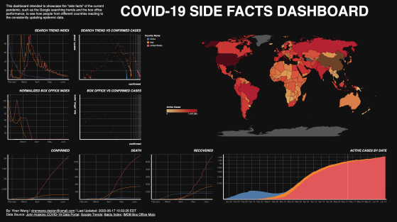
This project aims to understand the side-facts about COVID-19, to see how people in different countries reacting to the reported numbers about the pandemic.
Visual Designer | Data Visualization Designer
This project aims to understand the side-facts about COVID-19, to see how people in different countries reacting to the reported numbers about the pandemic.

The New York City Department of Health and Mental Hygiene (DOHMH) executes unannounced inspections on restaurants in the New York City area and utilized a letter grading system to evaluate the result. This research tried to determine whether bias is included in this system.

According to a 2018 Lego study, “the vocabulary of bricks has increased significantly resulting in sets sharing fewer bricks.” Tracing the number of Lego bricks over time may be telling of the increasing specialization and complexity of Lego sets. Looking at the number of specialized pieces in relation to interchangeable pieces may also help us determine if increased specialization has resulted in fewer shareable bricks.

The outcome is a dot map shows how the top 15 street tree species’ color varies monthly, and a series of choropleth map based on the GIS calculation of this data, expecting to answer questions such as where to see the cherry blossom, or where is the most “colorful” area in the New York City.

This is a network among the registered players in FIFA 2019, a well-known video game of soccer, with the nodes as players, and the edges as the shared skillset. In this network, the players have more similar skill set will have a stronger connection.

This map explores the average property price within a 500 meters buffer of each subway line in New York City.
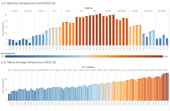
View Interactive Map on Tableau Public Introduction Is global warming a real thing? I haven’t doubted it since I learn … More
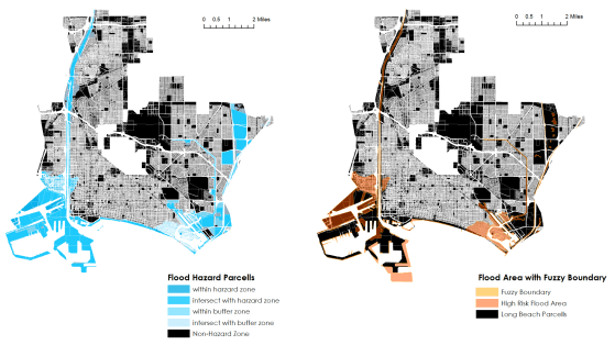
This project is done as a practice of ArcGIS, in Prof.Christensen’s Intro to GIS course, and is based on the … More

The “Beer Belly of America” map shows where in the United States has more bars than grocery stores.
