The outcome is a dot map shows how the top 15 street tree species’ color varies monthly, and a series of choropleth map based on the GIS calculation of this data, expecting to answer questions such as where to see the cherry blossom, or where is the most “colorful” area in the New York City.
Tag: GIS
Which is the “Most Expensive” Subway Line in NYC?
This map explores the average property price within a 500 meters buffer of each subway line in New York City.
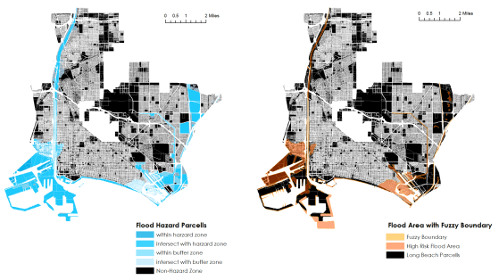
Map of Long Beach City Flood Hazard Area, 2017
This project is done as a practice of ArcGIS, in Prof.Christensen’s Intro to GIS course, and is based on the … More
The Beer Belly of America
The “Beer Belly of America” map shows where in the United States has more bars than grocery stores.
Where Does MTA Keep Their Art Work Collections?
A python web scraping and JavaScript practice on mapping the artwork collected in the New York subway system.


