Skip to content
Yiren Wang

Yiren Wang

Visual Designer | Data Visualization Designer

  • Data Visualization
  • Graphic Design
  • GIS
  • Web Design
  • User Experience
  • Research
  • About Me

Tag: Map

Look into the “Side Facts” Data of COVID-19: A Practice of Data Visualization Automation

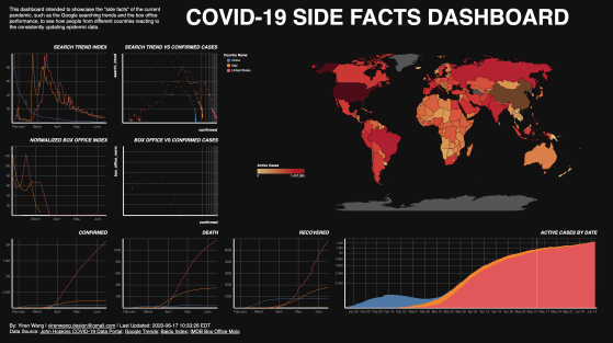
This project aims to understand the side-facts about COVID-19, to see how people in different countries reacting to the reported numbers about the pandemic.

Data Visualization, ETL, Map, Python, Web Development

The Colorful NYC: A Map of Street Trees’ Blossom and Defoliation

The outcome is a dot map shows how the top 15 street tree species’ color varies monthly, and a series of choropleth map based on the GIS calculation of this data, expecting to answer questions such as where to see the cherry blossom, or where is the most “colorful” area in the New York City.

Data Visualization, GIS, Map

The Beer Belly of America

The “Beer Belly of America” map shows where in the United States has more bars than grocery stores.

Data Visualization, GIS, Map

Tags

Data Analytics Database Data Visualization Design ETL GIS Graphic Design Information Visualization Map Network Analysis Python R Research SQL Typography User Experience Video Visual Identity Web Design Web Development
Website Powered by WordPress.com.
  • Follow Following
    • Yiren Wang
    • Already have a WordPress.com account? Log in now.
    • Yiren Wang
    • Customize
    • Follow Following
    • Sign up
    • Log in
    • Report this content
    • View site in Reader
    • Manage subscriptions
    • Collapse this bar