This is an experimental project for my typography class, instructed by Adam Lucas. In this project, I was assigned make a publictation to present our own ideas of typography, base on three articles about the famous Max-Tschichold dispute, which is on how typography should progress, raised by Jan Tschichold and Max Bill, who both were the representatives of Mordernism, in the 1940s’. The first two articles by Tschichold and Bill argued about the usage of serif font, and the third one, by Paul Renner, another symbolic font designer and typographer in the modernist era, was a comment on the dispute. The final outcome discussed the voice in mind when a second language speaker is reading an English article.
Other than a visual solution, typography is also a functional device of reading. I, as a second language user, however, have met a lot of problems on reading complicate material, no matter how well the typograph was set. This fact gave me an idea: why don’t I show this struggle with typography?
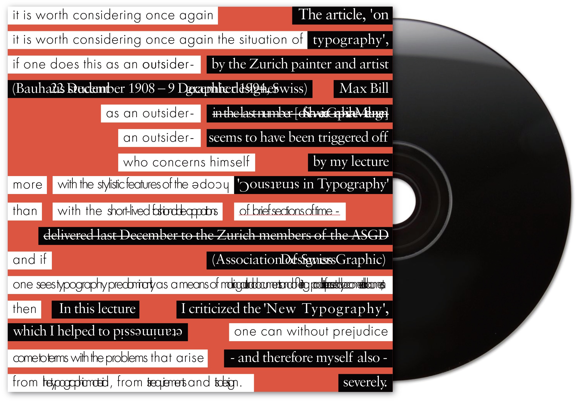
At the beginning, I was simply trying to depict some kind of chaos. It was the chaos that was in my mind when I was reading these articles as a Chinese. Words, phrases, prepositions, and even the Chinese explanations were mixed up there. I broke down the two articles into saccads of the length I would have, and create a jumbled composition with them. It was also the chaos as two articles melting as one. Since these two articles were written as a dispute, they have a connection and confliction within them. I was also trying to show what people would have in mind when they were trying to read two articles together. At the begining, I used bigger fonts to show a bigger font in mind, and overlapped letters to show the saccads that confuses me. Terms and names usually has some description below, so as the words that I had to check my dictionary. However, it was way too messy. Therefore, I then tried to simplify the composition by reducing treatments on the texts.
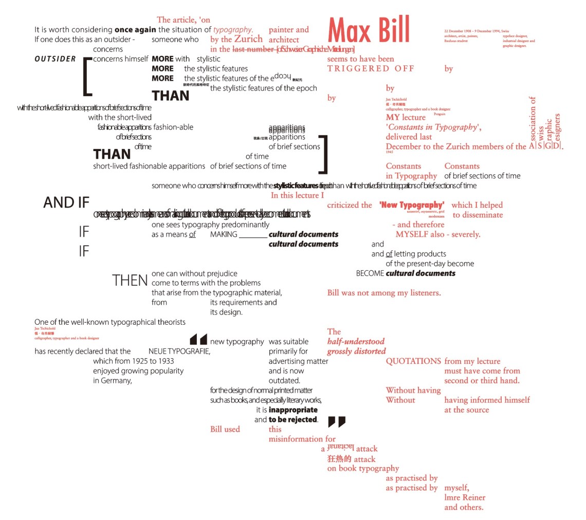
Before I adopted methods include different fonts, capitalize, color code, font size, etc. It was redundant and messy. I then decided to stick to only two fonts – Sabon, which is designed by Jan Tschichold himself, and Futura, which is a symbolic modernist font, and it is actually designed by Paul Renner. Another reason of the font choice was that the serif – sanserif contrast also fit the dispute’s topic. I used Futura on Max Bill’s article because he refused all serif fonts, while I set Tschichold’s article in sabon, since he defend for using it in running texts. I inherited some treatments from the early attempt. With the repeating of words, I shows the actual repeat sounds in my mind while reading, and the overlapped letters to show my confuse. I added a background color to Tschichold’s article in order to separate it from Max Bill’s words. Note that the spacing and font size are integrated in this version.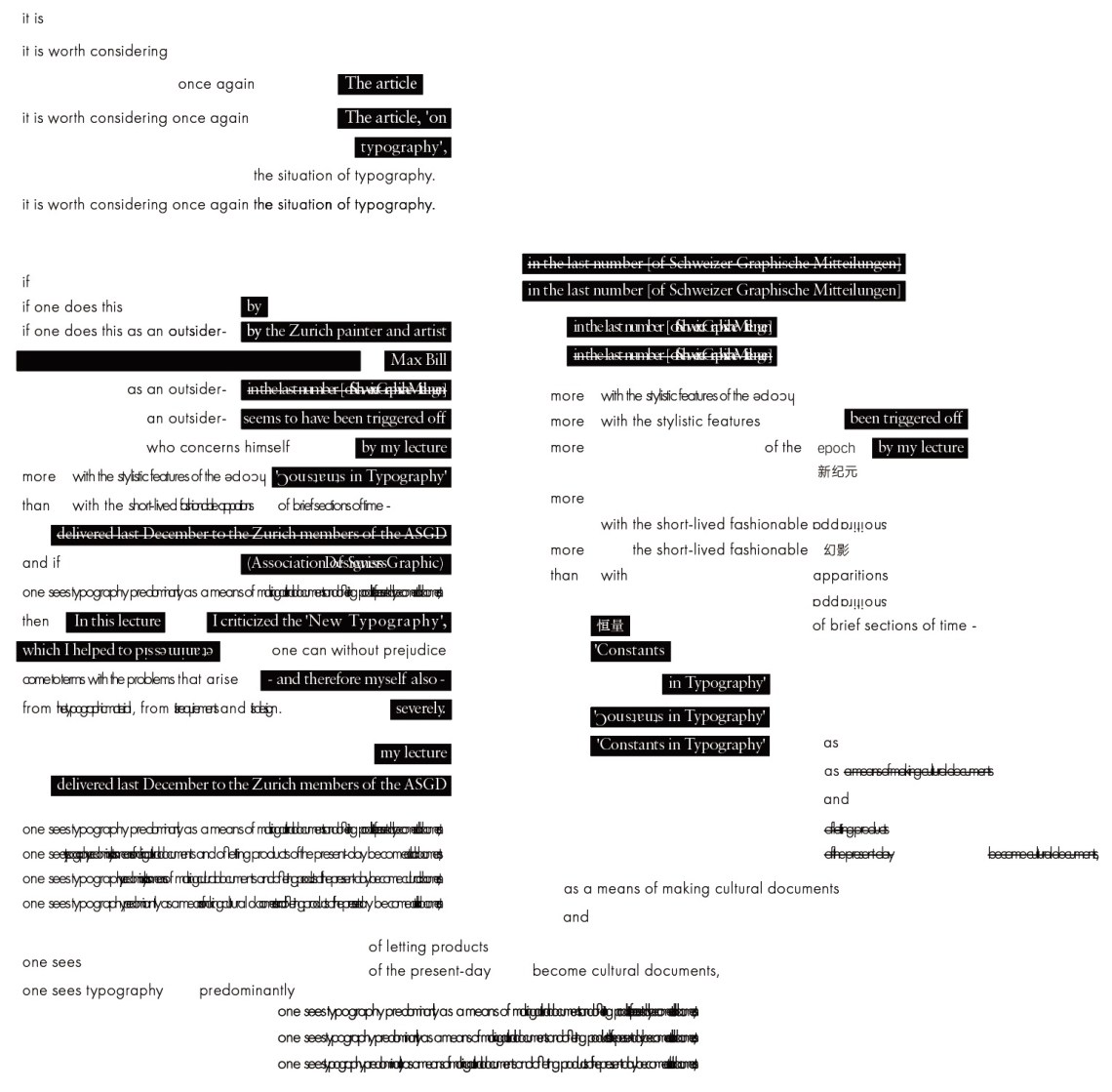
Finally, I decided to record an actual soundtrack to this design, since the goal was to represent the voice in my mind when I was reading. The sound has also been tortured to fit the typography. Hopefully, this project can be a showcase that helps first language users to understand how English would sound like in a Chinese’s mind.
