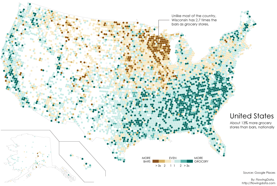
In the year 2010, Floating Sheep Group mapped the first version of “Beer Belly of America”, which is a thematic map compared the counts of bars against the amount of grocery stores. The Wisconsin area, as being depicted in the image, has a much higher than average number of bars.

Later in 2014, Nathan Yau of FlowingData created an alternative version of this map, which answers two questions he asked:
1. The original map only showed a binary comparison. That is, areas were either colored as more bars or more grocery stores. What if we mapped the magnitude of the difference?
2. The data from 2008 comes from the now defunct Google Maps Directory and only represented references to bars and grocery stores (which maybe made the previous bullet point not worth doing then). Would using the newer Google Places API provide more detail?
As a lab exercise of my Intro to GIS class, Prof.Jeremiah T. Christensen asked us to create a new version of this theme. Following his instruction, I firstly created a binary comparison map, based on the data from the NAICS Association, which collects the registered drinking establishments (NAICS Code 722410) and grocery stores (NACIS Code 445110), in QGIS.
In this map, I created a meshed United States map of 20km diameter hexagons, and count the stores in each hexagon.
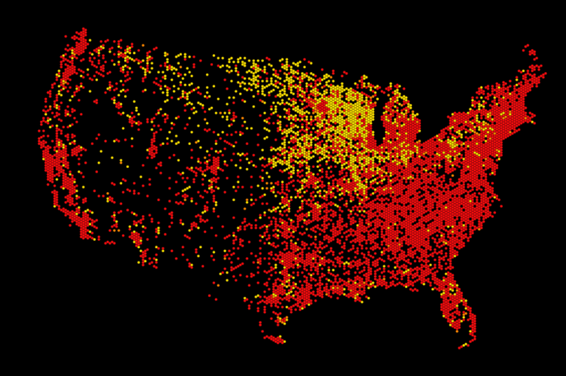
The map showed a similar trend to the 2010 and 2014 beer belly maps, but the hexagons have equal amounts of bars and grocery stores (colored orange) are too less to be seen. Therefore, I tried a similar approach to Nathan’s map, defined the orange hexagons as having similar amounts of bars and grocery stores.
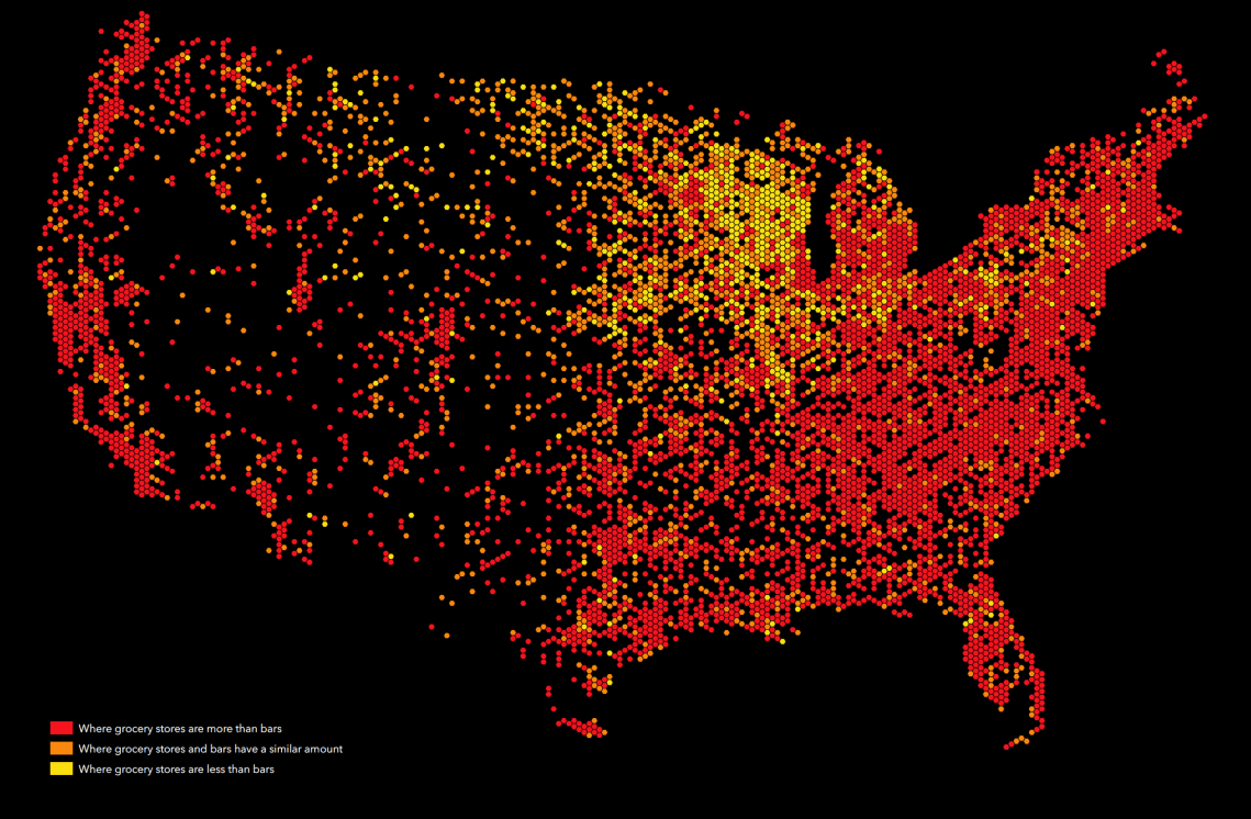
 The trends became clearer, and it even looked more aestically pleasing. Therefore, I decided to make the choropleth map showing more degrees of the trend. With QGIS’s SQL functions, I counted the difference between the counts of grocery stores and bars, and created a graduated map.
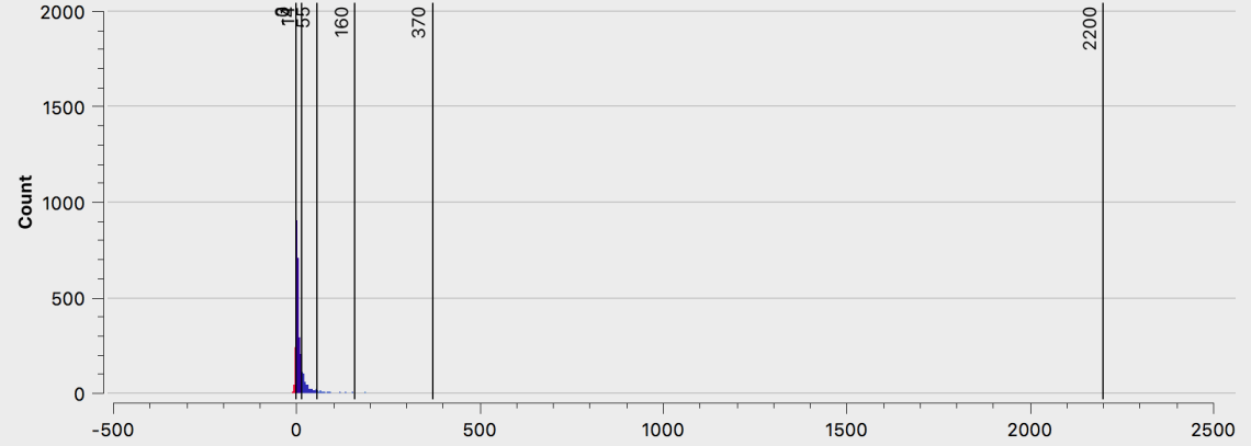
In order to show the trend clearer, I manipulated the gaps between each color in a quadratic way to fit the data’s pattern (see the histogram below). Further, since this map is focusing on the “beer belly”, I chose to use red-ish color to show the areas with more bars, and in contrary, make the blue more-grocery-store areas sink down in the image.