
View the Interactive Deployment
INTRODUCTION
It is being said that the year 2020 started with a magic realistic beginning. Many unfortunate instances clustered together and strike humans altogether. The most worldwide influential one is no doubt the COVID-19 pandemic, which has not only affected the world as a widely spread epidemic but also changed the world’s political and economical situation dramatically. No countries or individuals can get away from its impact.
Given the unprecedented impact, a plethora of data visualizations about COVID-19 has emerged. You could find thousands of data visualizations back to early February, and much more now. On the other hand, the dispute about COVID-19’s data validity and the potential of misleading has never stopped. Such disputes are around the data collection and reporting methodologies (O’Neil, 2020; Patino, 2020; Linsi and Aragao, 2020), or whether the numbers are ‘actionable metrics’ (David, 2020; Ries, 2009). Many articles and reports have accused the Chinese government covered up facts and manipulated the data (Campbell and Gunia, 2020; Romaniuk and Burgers, 2020), while Chinese state-owned media (Xinhua, 2020). Some democratic medias questioned the current US government’s slow response and misconduct (Fink and Baker, 2020). I won’t surprise if some of these are rooted in political objectives.
Such disputes continue and cover the actual fact of COVID-19 in a denser mist. I started asking myself a question that is there a way to use these questionable data, whether there are any numbers that cannot be manipulated and hid, or affected by the non-standard data collecting process. At that point, I started to put my attention to the circumstantial evidence, or the ‘side facts’ about COVID-19.
Besides the epidemic numbers, many indices (i.e. index of the ‘side facts’) have fluctuated because of it. According to different news reports, after the COVID-19 outbreak, it was observed that box office in many countries touched the base after COVID-19 outbreak; the sales of games on Steam showed a peak after people work from home, the stock market in different countries lost at different levels, except some special stocks such as the ones related remote working or other internet services. All of these indices are not related to the COVID-19 data directly, i.e., the observation on these indices would not be affected by the COVID-19 data’s validity, but are reflecting the general public and the government reaction to the numbers. Thus, monitoring these data might be able to help me understand the difference in people’s reactions in different countries.
The other facts that have come to my mind also include traffic reduction, certain websites’ click ratio, and searching trends in different countries. However, not all of these data can be used to compare countries on a worldwide scale. Moreover, the scope of this project is also a limit. In the end, a dashboard showcases two “side facts” of the current pandemic (i.e. the searching trends and the box office performance) has been created, which can be used to see how people from different countries reacting to the consistently updating epidemical data.
This project is part of my study at Pratt Institute, under the instruction of Professor Can Sucuoglu. It is also targetted at practicing my Python skills and tends to automize the whole data ETL and visualizing process, in order to face the situation that is consistently developing and changing. All the codes and retreived data can be found on the project Github repository.
DATA SOURCES
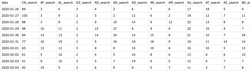
COVID-19 Data: John Hopkins COVID-19 Data Portal
Searching Trend Data: Baidu Index for China, Google Trends for the other countries
Box Office Data: IMDB Box Office Mojo
Base Map: Natural Earth World Map 50m
DATA PROCESSING
In this section, the logic and methods that I’ve taken to create the data retrieving and cleaning functions will be introduced. Some functions and codes are also attached as supporting material, but they are not copy-paste-and-run ready. On top of each topic, links to the related python files will be provided, please check that for complete scripts if you are interested.
COVID-19 Data
Since my goal is to see people’s reactions to COVID-19 data numbers, I utilized one of the most popular COVID-19 data sources, provided by the CSSE lab of John Hopkins University. At the beginning, this data was stored on an open spreadsheet. They then transport the storage to a Github repository, which made it easier for me to grab this data daily and automatically. It was quite easy to download their daily update CSV from the Git.
There were two tricky parts – one is that they were using country names instead of ISO country codes, which has the potential to trigger merging problems in the later steps; the other is that the structure of their data frames, which are horizontally growing spreadsheets that use ‘date’ as columns.
To solve the first problem, the most convenient way would be using the PyCountry module, which provides the ISO databases for standard country names and codes. An one-liner could easily retrieve the ISO Alpha-2 country code by country name.
from pycountry import countries as ct
country_code = ct.get(name=country_name).alpha_2
However, the country names in the JHU dataset weren’t alway using the standard names. Therefore, an array of those countries and their cooresponding codes has been created, and I then used an if clause has been used to detect these countries. In order to detect new countries that being added to the dataset and not using ISO standard names, a try-except clause has also been used.
for country_name in new_df['Country/Region']:
    try:
        if country_name in completion['c_name'].tolist():
            # print('exception covered: ', country_name)
            country_code = completion['c_code'].loc[completion['c_name'] == country_name].item()
        # identifies the cruise ships in the data set considered as a 'country'
        elif country_name == 'Diamond Princess' or country_name == 'MS Zaandam':
            country_code = 'Cruise Ship'
        else:
            country_code = ct.get(name=country_name).alpha_2
    except KeyError:
        print('no result: ', country_name)
        country_code = 'None'
        pass
These two steps has been packed into a function for further usage.
Then I used the transpose() function. Note that setting the new country code column as a new index would save a lot of potential problems.
def remodeling(df, df_name):
    """
    transposing, column renaming,
    and date format converting
    :return: 2 dimension covid data
        - variables: country
        - observations: counts, by day
        - table: confirmed/death/recovered, depending on input df
    """
    # df_name = get_df_name(df)
    new_df = country_code_update(df)
    # new_df.rename(columns={'country_code': 'date'}, inplace=True)
    new_df = new_df.set_index('country_code').transpose().rename_axis('', axis=1)
    new_df.index.name = 'date'
    new_df.index = pd.to_datetime(new_df.index)
    new_df = new_df.add_suffix('_' + df_name)
    return new_df
Lastly, a function that stores the CSV files’ URLs has been created, and calls the former funtions to clean the downloaded data and return cleaned data frames, a suffix that specifies what the numbers are about i.e. confirmed, recovered, and death, was added to the column names.

Search Trend Data
It is presumable that when there are more searches about something, people care more about the object. In other words, when there are more searches about COVID-19, the general public concerns more about the epidemic. Therefore, I selected the word “coronavirus”, which is the most commonly used word about the virus, as a search term, and retrieved the Google Trend data about this word, in order to see how the public’s focus concentrate and fades out during the pandemic. Further more, Baidu Index data (China version of Google Trend) have been used for that Google is blocked in mainland China, and the Chinese word of coronavirus “冠状病毒” has been used as the searching term.
Before getting deeper into coding, it is important to understand Google Trend data first. As Simon Rogers has explained in one of his Google News Lab articles, Google didn’t reveal the actual searching counts, but an index that shows the trend in the selected time and location.
The context of our numbers also matters. We index our data to 100, where 100 is the maximum search interest for the time and location selected.
What is even trickier is that the access of Google Trend data has a time limit. The query results are on different scales when you are looking for trend within different time spans. For instance, results of the past one hour will be search trend of each minute, while results of the past week is by one hour, and the result for the past 3-month are by days.
This limit raised two questions. One is simple enough, that which time span should I use for my purpose. To avoid the noise of daily patterns (more searchings during the day time while less in the night), I decided to query the past 3-month trends only. It would also make sense when I’m looking at an incident that happens across months. The other question is harder. The time span of this pandemic will certainly surpass 3-month, and then the index for two different time span will be based on two differet numbers. In other words, the tables downloaded on different time cannot be simply concatenated together but requires some calculation in front. Therefore, it would be reasonable to separate the process into two parts: get the 3-month searching data, and then update it with some certain formula.
Get Search Trend Data
The Python module “PyTrend” is so far the most convinient way to get Google Trend data into Python. With its function TrendReq() and build_payload(), it is easy to get Google Trend data with sepcified keyword, timeframe, and country code:
def get_google_trends(country_code):
    """
    get designated country's google trend data
    :param country_code: ISO alpha_2
    :return: google trend data frame
    """
    from pytrends.request import TrendReq
    pytrend = TrendReq()
    keywords = ['coronavirus']
    pytrend.build_payload(kw_list=keywords, timeframe='today 3-m', geo=country_code)
    # get past 3 month of trend from today
    # search more than three month will return weekly accumulated results
    # data storing needed
    df = pytrend.interest_over_time()
    df = pd.DataFrame(df)
    return df
Running the above function will return a dataframe of a country’s search on ‘coronavirus’ in a three-month time span, looping an merge it will then provide a data frame similar to the COVID-19 tables.
Bypass the 3-Month Limit
However, as being stated, this function can only cover the last three months, and some calculations are needed when the total duration is longer. The first ‘three-month’ data I got from Google Trend was between Januarary 26th and April 24th (it’s 90 days actually), which is being used as a base search trend data frame in the calculation (base table). And when I run the exact same function on the next day, a new table will return with the first days (Jan 26) excluded and a new last day (Apr 25) added. Our goal is to left join the two tables and to make sure the search trend index won’t be messed up during the join.
Since the Google Trend index is based on the maximum search interest, we can derive two possible situations when joining the base table and the new table together:
- In the first situation, the date with the maximum search interest (i.e. the date with the index value 100) in the new table remains the same with the base table. If so, a simple concatenate will satisfy the demand;
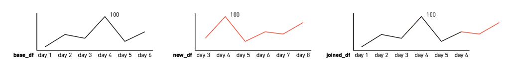
2. In the other situation, the max dates in the two tables are not the same. In that case, we need to normalize the new dates that are going to be add to the base table. The formula is simple enough:
imax = inew_max * (100/iold_max)
For instance, in the below charts, the value of day 8 will be 100*(100/90) = 111.11, and round it will return 111. Then consider this day as the new maximum date:
i1 = i0 * (100/imax)
This calculation will provide a new index for each date that considers day 8 as the new maximum date with index value of 100, which is the dashed line in the below charts.
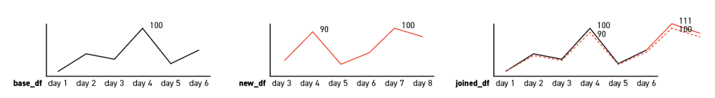
It is worth mentioning that these two simple formulas are flawed that, say the max date are day 1 or day 2, the calculation would fail. However, for the reason that the table will be updated daily and such case doesn’t exist in this specific project, such situation is not being considered.
Chinese Search Trend Data
On the other hand, for the reason that Google is blocked and rarely used in China, and the fact that China is one of the most important entities in the pandemic, it would be less rigorous to keep using Google Trend data for the country. Moreover, unlike most countries in the world, Chinese tend to use the Chinese word “冠状病毒” instead of the English word “coronavirus” as the search term. Therefore, Baidu Index data has been introduced and “冠状病毒” has been used as the search term.
Unfortunately, there are neither Python module nor a download button as the equivalent Google service has. Scraping it is also relatively complicate and less efficient for the scope of this project, so I’ve manualy collected the Baidu data. As a workaround, a mini-program was created to open up the Baidu Index page and make sounds to notify me when the Baidu data is needed to be updated. It is also worth mentioning that the numbers of Baidu Index result is different than Google Trend, which is the weighted sum of the search counts. In the other words, it is also a number that goes up and down when there are more and less searches. Thus, we can do some simple calculation to match it with the Google Index that is in the range of 0 to 100.
Box Office Data
For the box office data, I scarped the IMDB Mojo database and cleaned it to the same structure. Mojo has stored the US (domestic) and Interational data separatedly. On the main page of international box office, a list of countries and their ISO Alpha-2 country codes can be found. These Alpha-2 codes are used in each country’s individual page URL. This list is also useful later when joining the box office table with the other tables. It is because that the mojo database didn’t cover many countries and have combined some countries’ data into a regional statistic and some made up country codes are being used for these regions. Such regions are excluded later.
On the other hand, Mojo provides international box office data in two different formats – by year or by weekend. To get the more detailed information, by weekend data were being used. Mojo stores the data in instead of specific dates, but a date range of the weekend. To match this data with the former tables, two functions was created to generate the past Sundays of the designated year (default 2020).
def last_sunday(today):
    today = datetime.date(today)
    # if today is sunday return today
    if today.weekday() == 6:  # 6 means sunday
        sunday = today
    # otherwise get last sunday
    else:
        # see https://stackoverflow.com/questions/18200530/get-the-last-sunday-and-saturdays-date-in-python
        d = today.toordinal()
        sunday = d - (d % 7)
        sunday = datetime.date(datetime.fromordinal(sunday))
    return sunday
def sunday_df(year=2020):
    """
    get a data frame of all (past) sundays of the input year
    :param year: default 2020
    :return: df of all (past) sundays
    """
    year = int(year)
    sundays = []
    # get an input today if the year is 2020
    if year == 2020:
        today = datetime.now()
    # else get the last day of the designate year
    else:
        today = datetime.strptime((str(year)+"-12-31"), '%Y-%m-%d')
    # get last sunday result using to input today
    last_sunday_result = last_sunday(today)
    week_num = int((int(today.strftime('%j')) / 7)-1)  # %j represent the day of the year
    w = -1
    while w <= week_num:
        sundays.append(last_sunday_result - timedelta(w*7))
        w = w+1
        # print(w)
    df = pd.DataFrame(sundays, columns=['date'])
    df = df.drop(0).reset_index(drop=True)
    return df
The first function returns the last Sunday and then the second function calls it and generates a data frame of Sundays. Which is being used to merge with the box office data frames by week number. Similar to the former tables, the column of box office value in USD are taken out from each country’s table and concatenated together, using the date as an index. US (domestic) data are also merged merged together later.

Most empty cells can be observed are because of that movie theaters in many countries are closed during the pandemic and Mojo didn’t have valid data to present.

Similarly, the US data is also been scraped. The only difference is that the US data is more detailed and included reduntant rows to separately store long-weekends data. Since the long weekends always stored after the normal weekends, it can be removed by a simple one-liner:
df = df.drop_duplicates(subset=['week'], keep='last')
Moreover, for the reason that the box office market varies in different countries. In order to observe and compare the influence of COVID-19 between them, it would be reasonable to normalize these numbers. Therefore, I further scraped the box office data in the year of 2019 and calculated the mean box office for each country, then use it as the fraction base to divide the numbers in the 2020 table.
Merge and Transpose the Data Frames
In order to make the data ready for visualization, all the tables were stacked and merged together. Since these tables are now in a rectangular structure, which take countries as columns and dates as rows, it needed to be stacked before joining. There’s a stack function come with Pandas. However, it returns a series and requires more complicate adjustments. To save some back and forth, a function that transposes each table into a three-column data frame with two columns functioning as indices:
def transpose_for_altair(df, df_name):
    # df = new_index_for_viz(df)
    col_num = len(df.columns)
    row_num = len(df)
    new_df = pd.DataFrame(columns=['country_code', df_name, 'date'])
    for i in range(1, col_num):
        country = [df.columns[i]] * row_num
        country = pd.Series(country)
        count = df.iloc[:, i].to_frame()
        days = df.iloc[:, 0]
        new_rows = pd.DataFrame(pd.concat([country, count, days], axis=1))
        new_rows.columns = ['country_code', df_name, 'date']
        new_df = pd.concat([new_df, new_rows])
    new_df['country_code'] = new_df['country_code'].str[:2]
    new_df = new_df.reset_index(drop=True)
    return new_df
Then these data frames can be easily merged by the two index columns, country-code and date, and return as a new table, which has been later saved as all_data.csv:
def easy_merge(df_a, df_b):
    df_a['date'] = df_a['date'].astype(str)
    df_b['date'] = df_b['date'].astype(str)
    my_index = ['country_code', 'date']
    new_df = pd.merge(df_a, df_b, how='left', left_on=my_index, right_on=my_index)
    return new_df
VISUALIZATION
In this project, the Altair library has been used to produce the final visualizations. Five line charts, two scatter plot, and one area chart have been created to present the data about coronavirus and its side facts; and one choro pleth map that colored by the current active cases was used as a selector.

Two data frames and one shapefile has been used to create the visualizations. The side facts (search trend and box office) and the JHU COVID-19 data (confirmed, death, and recovered) has been plotted as five line charts. An active cases number has been calculated by substract death and recovered number from the accumulated confirmed cases, and been plotted as a stacking area chart. This number is also been used to create the choropleth map. To compare the side facts and the reported number and see how the general public reacting to the numbers, two scatter plots are created, using the side facts as y-axis and the confirmed cases number as the x-axis. Using confirmed cases is because that during the pilot visualing tests, it is being observed that the confirmed cases are most corresponding to the side facts, and that presumably the general public tend to react to the reported confirmed cases, instead of the death, recovered or even active cases.
The detail of the configures and scripts can be find from viz_gen.py and a Jupyter notebook at the project repository, and won’t be covered in this post. Instead, some tutorials that I’ve studied from, and specific set up with their reasonings will be introduced.
Interactive Charts
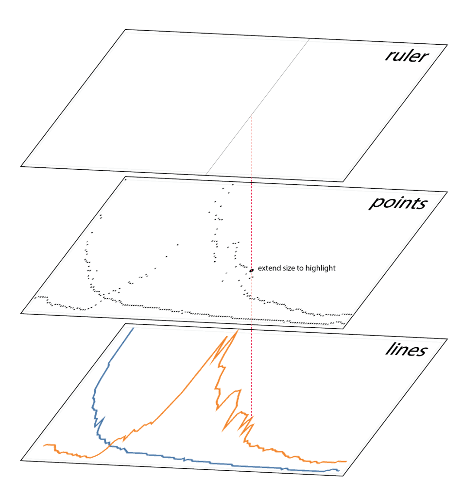
It is not too hard to configure a regular line chart with Altair, which even defaultly has hover-on interactive features.
However, as Mattew Kudija has suggested, it would be more reasonable to have a transparent point layer on top of it, and enhance the hover-on performance. Beyond that, this layer is also be used to highlight the selected points. Using Altair’s mark_rule() function, a ruler layer has also been added as well. This layer provides a guiding line that helps the audience to determine the selected data points.
The same setting has been applied to all the line charts. For the point charts, an additional point layer has been added to highlight points, in order to match the visual language of the line charts. For the area chart, a transparent stacking bar chart was used instead, which has the same layout with an stacked area chart.
Now that we have some interactive charts, but since there are hundreds of countries, and the line charts looks like this:
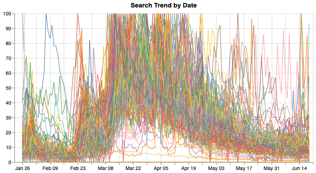
Too many lines are overlapped together and nothing can be read out of it. Therefore, I wanted to create a selector with which audience can select countries and view and compare the COVID data about them.
Choropleth Map and Selector
Altair’s transform_filter() function can be used to select and filter data, and a variety of ways can be used to create a selector. One appropriate way for this project is the dropdown menu. However, since there are too many countries, it would be an extremly long dropdown. For the same reason, a boolean selection is not so appropriate here as well. Therefore, I decided to add a map to the dashboard and use it as an country selector.
It is needed to clarify that Altair is not the perfect tool to visualize geographic data, even though it does have a mark_geoshape() function that would allow you to make maps through geojson files, the functionality of it is very limited. For instance, it can only draw maps with out zooming functions, and there are only a few projections can be used. Luckily, it can still be used as an selector. Moreover, to make the map more informative and visualy pleasing, the current (most recent) active cases of each country was used to color the map. Thus instead of all_data.csv, a filtered covid_today.csv was used here. The shapefile was later read in as a geo-dataframe, then merged with the today’s data and loaded as json format.
base_map_path = 'data/base_map/base_map_50m_4326.shp'
gdf = mapr.get_gpd_df(base_map_path, True)

# merge geo data with covid_today data
country_map = gdf.merge(today_data, left_on='iso_a2', right_on='country_code', how='outer')
# covert geo data frame to json and extract 'feature' section
choro_json = json.loads(country_map.to_json())
A choropleth map was created following A Gordon’s tutorial, and a top level selector that uses country code was added.
selection = alt.selection_multi(fields=['properties.country_code'], empty='none')
Similar to the charts, the map in the final deployment is also a combination of multiple layers, but for different reasons. What you can see will be three layers that stacks over: the base layer, the choropleth layer, and a selector layer.
The base layer is color by only one color (#555555), which can only be seen when a geometry has no active-cases data therefore no color will be filled in the choropleth layer.
The choropleth layer is just the same, but colored by the current active cases. Note that the data is scaled with symlog method, which reduces the influence of US, an outlier in the comparing. As it can be observed from the below world map of active COVID-19 cases (Slide to see the difference between ‘symlog’ scale (left) and linear scale (right)), US has totally skewed the plot that the differece among other countries can hardly be seen when using the normal scale.
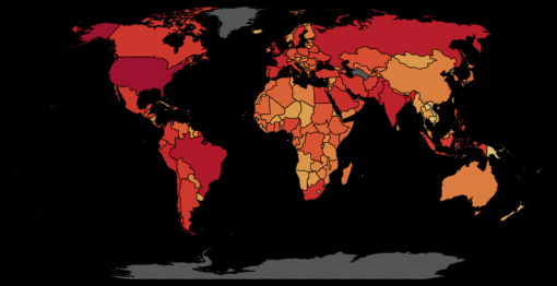
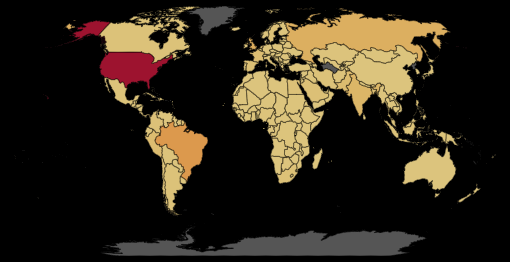
The third layer is functioning as a selector. However, it was added more for visual reason. The same fuction can be satisified on the choropleth layer, while the third one added a darkening effect when selecting a country.
Concatenate, Top-level Configuration, and Writing Out
With all the charts and the map ready, a layout was designed to stress the relations among these charts, following this, a dashboard was built by concatenate the material.
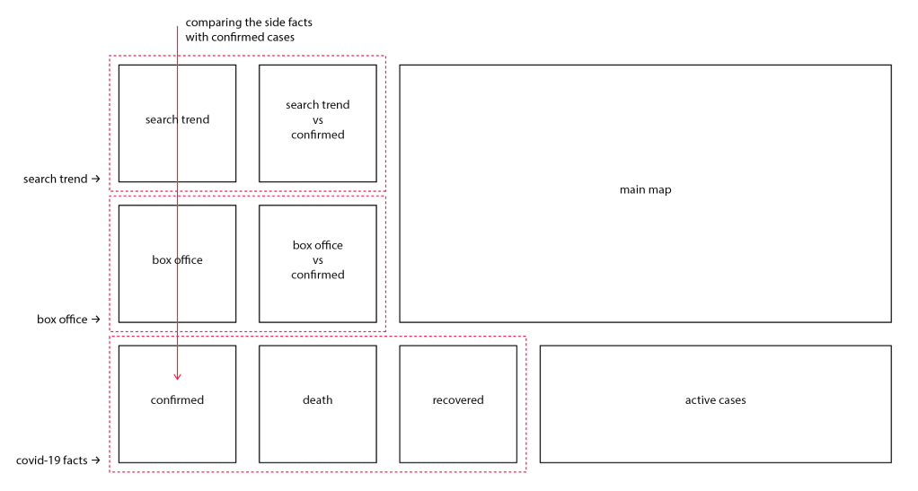
A series of top-level configuration was then applied. Chart borders and axis ticks are removed to reduce the none-data ink, while the axis has been stressed. The grid has been kept to display how some of the charts are scaled. These configures has been encapsulated into a function, that being called each time running the program.
Lastly, the final dashboard was written out as an HTML file. It is worth mentioning that, an additional argument was added that ask Altair to render the HTML using SVG rednerer (default canvas). It is because, as stated above, Altair doesn’t support zooming for maps. Rendering it with SVG renderer would allow users to select smaller countries by using the browser’s magnifier function, for that SVG won’t be any resolution lost.
output.save('altair_viz/new_viz.html',
            embed_options={'renderer': 'svg'}
            # default canvas rendering, change to svg rendering
            )
PROCESS AUTOMATION
It is cool to get all the data with different methods in Python, but that’s not good enough. The COVID-19 pandemic is an on-going event, and the data about it is continously changing and updating. Therefore, it would be meaningful to automize the whole process so that the data visualization can always be up to date.
With all the data processing functions ready, a Python program ‘all_data_get.py‘ that calls all the functions, retrieve and clean all the related data and then update the existed tables was built. Since I developed all the functions under PyCharm IDE, to adapt this function to Terminal environment, use sys module to append the project directory to system path in each Python file is a must:
import sys
sys.path.append('/Users/wildgoose/PycharmProjects/covid_19_CE')
Running this program would update all the data stored locally, but it won’t update data to the web, in the case of this project, to the Github repository. Moreover, it is also necessary to run the visualization generating scripts and update the index.html everyday.
Github Auto Commit
The first thing needed is to connect to Github with SSH. SSH (Secure Shell) is a protocol that allows you to make a secure connection between a client and a server. That says, it skips the usual “user name” and “password” step, but use an alternative way to authenticate your access, which will obviously helpful for our automation purpose. The Github Help Center’s documentation Connecting to GitHub with SSH has walked through the method thoroughly (but make sure you are only doing this on a secured platform, i.e. your own computer).
After the connection is made, you want to change your local repository’s setting, to make it connect with Github using an SSH URL. Usually, you are accessing your Github repo using an ordinary HTTPS URL:
https://github.com/alanalien/covid_19_circumstantial_evidences.git
An SSH URL is slightly different:
git@github.com:alanalien/covid_19_circumstantial_evidences.git
If you open your terminal (or cmd if you are a Windows user) and go to the directory of your current project, and listing the existing remotes using the following code, you will see something like this:
$ git remote -v origin https://github.com/alanalien/covid_19_circumstantial_evidences.git (fetch) origin https://github.com/alanalien/covid_19_circumstantial_evidences.git (push)
Since we have already connected to Github with SSH protocol, we can alter the origin to the SSH URL:
$ git remote set-url origin git@github.com:alanalien/covid_19_circumstantial_evidences.git
And verify the change:
$ git remote -v origin git@github.com:alanalien/covid_19_circumstantial_evidences.git (fetch) origin git@github.com:alanalien/covid_19_circumstantial_evidences.git (push)
After setting this up, you can use your Terminal to commit your local Github repository to remote repos with the following codes:
$ git add .
$ git commit -m "your commit message"
$ git push -u origin master
However, this can hardly be called “automatic”. A tutorial site Steadylearner has suggested a possible workaround to automatically commit files with Python using the subprocess module and SSH URL. A simple one-liner $python commit.py will help users to commit changes. However, for the purpose of this project, what I needed is to commit some selected files (updated data) or directory. Therefore, only $ git commit [your file/directory] -m "your commit message" is needed here. As Steadylearner has suggested, the subprocess module can be used here to embed this code in Python:
import subprocess as cmd
# commit changed files on data directory
cmd.run("git commit ./data -m 'data daily auto update'", check=True, shell=True)
# push the changes to remote repository
cmd.run("git push -u origin master -f", check=True, shell=True)
Running these scripts will therefore automatically commit the Github repository and then push it from local to remote. To make it more convinient, a function was build, a try/exept clause and a if/else clause was added to detect “nothing to commit” error and allowing user to add new files when commiting changes:
def auto_commit(content="data", comment="'data daily auto update'", add=False):
    """
    this function commit and push changes to the github repository
    :param content: string, directory or file name
    :param comment: string, the commit comments
    :param add: boolean, whether or not allow adding new files
    """
    import subprocess as cmd
    # add files if allowed
    if add is True:
        to_add = "git commit ./" + content
        cmd.run(to_add, check=True, shell=True)
    else:
        pass
    # then try to commit updated files
    try:
        to_commit = "git commit ./" + content + " -m " + comment
        cmd.run(to_commit, check=True, shell=True)
    # pass if nothing to commit
    except:
        pass

    # push the changes to remote repository
    cmd.run("git push -u origin master -f", check=True, shell=True)
Edit HTML with Python
One other thing is that the Altair configurations can only affect one <div> in the html, and it clearly needs some editing.

This won’t be a problem if you don’t want to automize everything, some simple CSS will solve the problem easily. However, if we want to update the HTML everyday, it would not be as simple. Thus, I tried to automize the HTML editing with Python as well.
At first, I wanted to edit the Altair generated HTML file directly. The basic method is using BeautifulSoup to access each element in the tree, and then modify or replace it. It will work fine with dozens of lines of code, and a relatively longer runtime.
Therefore, I later took a different approach. Viewing the Altair generated HTML, it can be found that all the visualizations are stored as a JavaScript codes in the <script> block, and then rendered in the a <div> with an id “vis”. It would be much simpler to replace only the <script> block than edit each of the elements. So I created HTML file (base_html.html) that includes all the stylings and additional texts with an empty div <div id="vis"></div>, and an empty <script> block, which matches the Altair generated HTML. A simple one-liner was then used to replace the empty <script> with the one with all the visualizations. In addition, the last update time in the footer is also updated in the same way.
from bs4 import BeautifulSoup
from datetime import datetime

# read altair generated html
with open('altair_viz/new_viz.html', 'r') as my_page:
    viz_soup = BeautifulSoup(my_page, features='lxml')
# read in formerly-set html layout
with open('temp/base_html.html', 'r') as my_page:
    index_soup = BeautifulSoup(my_page, features='lxml')

# get the script part from viz html
my_script = viz_soup.body.script

# them replace base html's script tag with it
index_soup.body.script.replace_with(my_script)
# insert today's time to footer
time_now = datetime.now().strftime('%Y-%m-%d %H:%M:%S')
index_soup.footer.span.insert(0, time_now)

# write the new soup to index.html
with open('index.html', 'w') as new_html:
    new_html.write(str(index_soup))
Schedule Automatic Data Get/Post
Although every thing can now be executed easily with running one Python file, it would still be tedious to run the same program every single day. After some investigation, I’ve found a tool, Crontab, come with the Mac OS system, that allows me to schedule tasks. Ratik Sharma has written a post introducing its usage.
Basically, Crontab allows you to schedule a task that runs on a certain time. However, as Ratik has pointed out, when the task is not a shell command, things might got a bit more complicate. In this project, the task will be running a series of Python scripts.
One work around is to create a excutable .sh file that runs a .py file. I firstly wrote a Python file that runs to updates all data and visualization, and push the changes to Github, using os and subprocess module.
import os
import subprocess as cmd
import sys
sys.path.append('/Users/wildgoose/PycharmProjects/covid_19_CE')

from data_post import git_update as update


os.chdir('/Users/wildgoose/PycharmProjects/covid_19_CE')

cmd.run('python data_get/all_data_get.py', shell=True)
cmd.run('python altair_viz/viz_gen.py', shell=True)
cmd.run('python altair_viz/html_editor.py', shell=True)

update.auto_commit('')
Then a .sh file (named run.sh) that holds the driver codes to run the Python file is being created, it looks like this:
python PycharmProjects/covid_19_CE/data_post/update_run.py
And then modified the permissions to make the .sh file executable:
chmod +x /PycharmProjects/covid_19_CE/data_post/run.sh
Now we a program that can be executed by crontab. Following Ratik’s tutorial, I entered the VIM mode to create a new crontab job.
0 6 * * * ./PycharmProjects/covid_19_CE/data_post/run.sh
The above code is basically telling the computer to run “run.sh” everyday at 6:00 am. After setting this up, click esc button and type :wq to quit VIM mode. After checking the set up be crontab -l, I can say the whole project is automized, and the data and visualization will be updated everyday without (almost, except for the Baidu data update) any manual operation.
OBSERVATION AND DISCUSSION
REFERENCES
Amanze Ogbonna. Accessing (Pushing to) Github without username and password
Github Help. Connecting to GitHub with SSH
Ratil Sharma. Scheduling Jobs With Crontab on macOS
Sergio Sánchez. Consistently Beautiful Visualizations with Altair Themes
Simon Rogers. What is Google Trends data — and what does it mean?
Steadylearner. How to automatically commit files to GitHub with Python
