International Urban Image Festival (IUIF) is a serial event that celebrates the beauty of image that tells stories about regular people’s life living in the cities. It took a photograph festival’s format but has the ambition to stand out by including more fortmats of images – videos clips, animations, and more.
When the client first came to me and ask me to design a new logo for the festival, not suprisingly, I made a bunch of drafts that stresses the idea of “photo” and “camera”. The client wasn’t very happy about those ideas, and told me that those ideas were too “photo-like”, and they want someting more abstract. One draft has stood out from all the ideas.
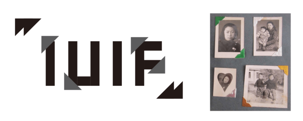
The draft was inspired by my old family albums. Back then, photos were neither stored on the cloud disks nor in a fancy album with transparent leaves. Some tin foil like material were stuck to each page and create frames that can hold printed photos. I utilized the triangular shape to trim corners off bold san-serif fonts and made the word “IUIF” looks like being held in the same way of an old album.
“It’s not just emphasizing a photo album or some physical items.” I explained to my client, “It’s more about an idea of keeping memories.” I can still remember that when I was a kid, when I lived with my grand parents, each time their old friends came visit, they would dig out some old ablums out of a wood box, and talk about the past old days along with seeing the old pictures, like a ritual. Nowadays, the threshold of photo shooting vanished, and anyone can take photos anywhere with a simple click on their smart phones. The ritual of recalling memories became one simple slide on a glass screen – or many many slides. However, rare people would do that so often. Memory with image, which used to be some kind of luxury, was devalued. I want to include such thinking in the logo and grant it, and the event it represents, some meaning other than photo itself.
My client was definitely touched by this story, though the shape now is still too representative and not modern enough. Therefore, I tried to polish it to be business ready. I tried to simplify it by removing elements from the font, and actually “trimmed” the corners off.

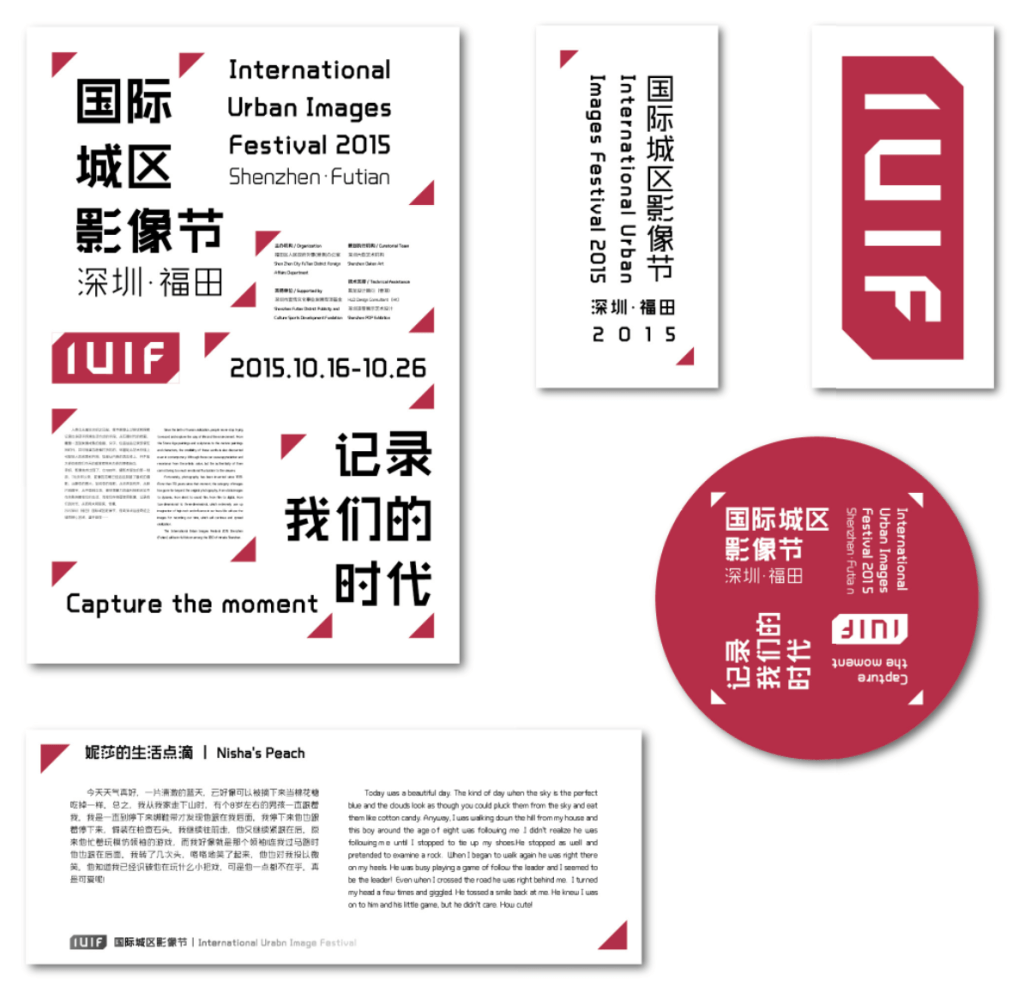
However, this simplified logo looks less like old albums, but a special font. To enhance the feeling of “image” with corners covered again, one container was added to make the logo more like a framed picture.

The idea of framing and the triangular shape was also duplicated and adapted to the event’s whole visual identity system.