Introduction
This is the third year since I came to New York. As one who grew up in the southern China, I’m used to a city where the four seasons are pretty subtle. The color of the city barely changes. I was shocked at the first time I encountered with New York’s autumn – there were so many levels of colors, and the scene out of my window changes almost everyday. I was even shocker when the spring comes after the white winter. Plants started blooming, one rises above the other, and some trees have too many flowers and the weight hold down their branches. The color of this magnificent city changes constantly. These gave me an idea of creating a time sequential map of the color changes in the New York City, which shows how the plants’ color changes seasonally. The outcome is a dot map shows how the top 15 street tree species’ color varies monthly, and a series of choropleth map based on the GIS calculation of this data, expecting to answer questions such as where to see the cherry blossom, or where is the most “colorful” area in the New York City. This project is part of my works taking the Intro to GIS course at Pratt Institute, instructed by Prof. Jeremiah Trinidad-Christensen.
Data Source and Data Filtering
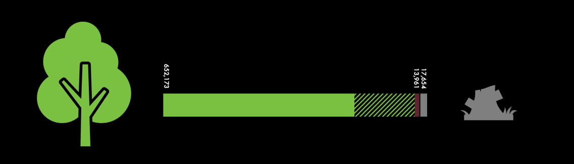
Since there are no appropriate source of all the plants, I compromised with the NYC’s 2015 Tree Census data, derived from NYC OpenData. This data is collected by an impressive project, 2015 Street Tree Census, conducted by the New York City Department of Parks and Recreation (NYC Parks). According to the 2015 Tree Census report, the project recruited 2,200 citizen mappers who spent over 12,000 hours to survey (almost) all the street trees in the city, and 666,134 (live or dead, plus 17,654 stumps) were recorded. Although it didn’t covers the park trees (which totally worth a census) and smaller plants, it is good enough to help me mapping out what people could observe in the city area.
After grapped this data, I filterred out 17,654 stumps and 13,965 dead trees, and I found that there are still 652,172 living trees included in this dataset. The examination I did was to see how many tree species were documented in this dataset. It is because I need to match this data with each tree specie’s blossom and leaf fall behaviour, and it turns out there were 133 species among all street trees were documented. It would be better if I can find a data source that include all species’ blooming and leaf falling dates and can directly merge with the tree census data, but I couldn’t find any until a late stage of this project (see discussion section). Therefore, what I had to do is to find only the significant tree species.
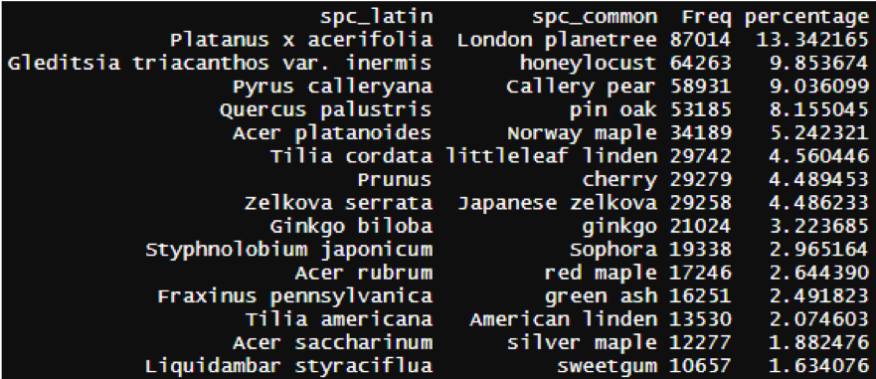
Using R, I calculated each species’s percentage of all trees. It is easy to observe in the following visualzation that some tree species are much more than the others.

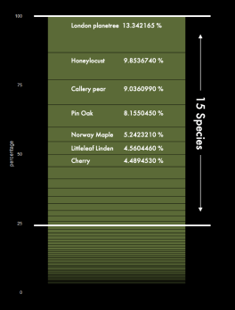
The trend is even more clear if we view it verically. There are more than 75% street trees belong to the top 15 dominating species. It can be observed that 13% of the New Yokr street trees are London Planetree, and then the Honeylocust and Callery Pear. Surprisingly there are only 29279 counts of Cherry trees, which has the most attractive and signatural blossoms in New York City. It has less than 5% of all street trees.
After this filtering, what have left are 496184 trees of 15 species, and this became the final data size of this mapping project.
Qualitative Research of Colors
Since there I couldn’t find proper observational data source for trees’ blossom and defoliation, I had to research each specie’s color in different months, and 15 species is a much more reasonable size of this process. In this process, I utilized Missouri Botanical Garden’s Tree Finder to determine each tree specie’s blooming time and color description, and checked the NYC Park’s Bloom Guide to confirm the findings. I then used the Google Image search to determine the actual color of the flowers in the spring and the leaf colors in the fall.
 The Missouri Botanical Garden’s Tree Finder provids a detailed list of each tree specie’s information, including the bloom time and bloom description (flower color). Notably, there are several flowers here were described “insiginificant”, which means the flowers are relatively small and not quite “showing”. Since Missouri is not geographically close to New York, I double checked the NYC Park’s Bloom Guide, which is more structural by month and hard to search information based on species, to make sure each blooming time is also correct in the New York City.
The second step is to determine the color of each flower. Although the Tree Finder has provided a description of the color, the information is still subtle. For instance, the color of Gleditsia triacanthos var. inermis “Honeylocust” is described “greenish-yellow”, while Quercus palustris “Pin Oak” has “yellowish-green” flower. Further, it would be easier to create the visual by color hexacodes than the descriptive information. In order to retrive the hex-color information, I utilized the Digital Color Meter that is built in the MacOS system, which can pick the RGB color of an area of the screen. With the search result of the species’ scientific names on Google Image, I used the Color Meter to pick the average color of each selected image with the most representative color of the flowers or autumn leaves. As shown in the figure below, I set a large “Aperture Size” large to capture an overall color of the planet, instead of just a bright or shadow side. 
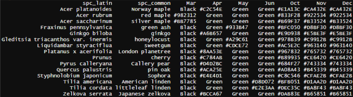
After turing the RGB values to hexa-codes, I added the color value of each month to the original species table (see below). Note that I defined the autumn as two stages, one is October and November, and then December. This is based on my personal experience without many research supports (see discussion section). The other months which are not included in the table are considered no significance color changes. All the trees in these months and those were not blooming/leaf falling were later colored in the same degree of green in the mapping process, in order to highlight the significant color changes, even though the diverse colors of different tree species are also attracting.
I have to admit that this qualitative reseach contains plenty of subjective decisions which lessen the impact of the final outcome, but it won’t harm the function of the final outcome as a map that shows a general transitioning of the color of the New York City.
Result and Analysis
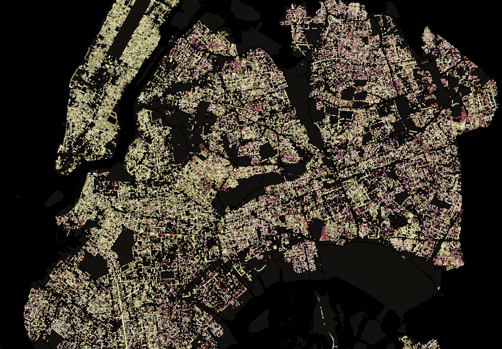
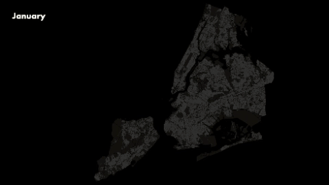
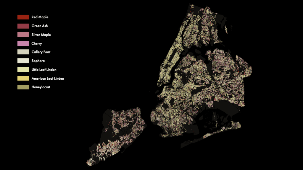
After merging the Tree Census data and the color table in QGIS, I created dot maps by each month’s tree color. After plot them sequentially, it gave me a stunning result.
However, I was expecting a more colorful result. One reason is that some of the flowers such as Pin Oak actually has green or yellowish green flowers. So in the following map, I fitered out all the green flowers and insignificant flowers, and include only the most “showing flowers”.
It is a pretty dot map, but it didn’t tell much. Therefore I made the following choropleth maps that tells story more statistically. The first one was used to answer my first question, that where should we see cherry blossoms (except going to the parks). In the map below, I calculated the count of cherry trees in each zip code tabulation area (ZTA), and normalized the count by area. What it tells is the density of cherry trees, the redder the area is, more likely you can observe stunning cherry blossoms there without step into any parks. Notably, on the east side of the Center Park, there are a area of dense cherry tree appearence. On the contrary, it didn’t happen on the west side of the Center Park. Therefore, even without the park tree data, we can assume that it is possible that there are more cherry trees on the east side than on the west side.
On the other hand, most tree species has different leaf colors (though not significant differences in most cases). Therefore, we can say there will be more levels of leaf colors in the fall when the species diversity is higher. For this reason, I calculated the diversity index for each ZTA, and created a graduated choropleth map to show that in which area there will be a more colorful autumn. Note that this can also be a species diversity map for street trees in the New York City.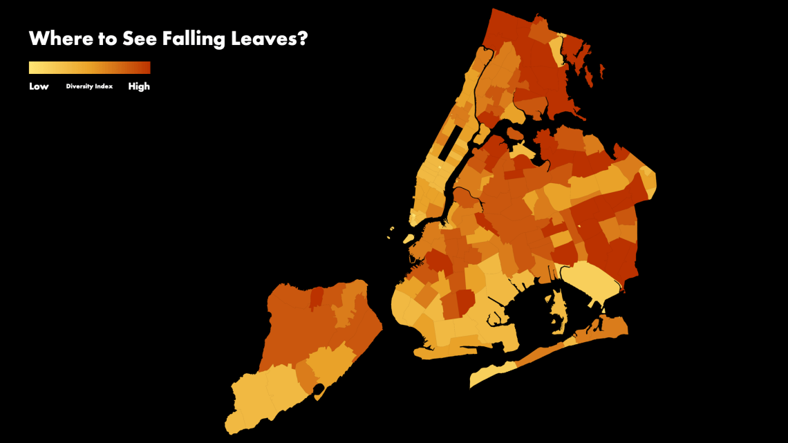 Lastly, I created a hexagon map which shows the “color trend” of the New York City. I picked my data for April, which is month has most species blooming, and separated the New York City to a bunch of 350-meter-diameter hexagons. Compare with the dot map, it will show the “colorfulness trend” more clearly, by sacrificing the details of each species.
 Note that this map is not normalized and showing the direct count of colors in each hexagon. Usually a map like this should be normalized by population (the count of trees). However, if we consider the audience who are expecting to see more flowers by following this map, the density doesn’t actually matters. In other words, it doesn’t matter if the reason of more colors appeared in these areas is that there are more trees here. However, it will be interesting to see the difference between the normalized map and the unnormalized one.
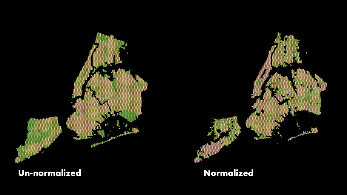 Both of the map used quantiles (equal count) to classified and used the same color theme. It can be observed that in the southern Staten Island and the two sides of the Center park, the normalized map appeared more pinkish. Compare with the un-normalized map, we can tell there might be less trees in these areas, but most of them are different species.
Discussion
Taking a step back – I would have admit that this project is far from finished. Due to the time limitation as a short school project, and my deficiency of skills and experience, there are a lot of thoughts have not been achieved.
As being stated, this map is based on many subjective decisions, such as the stage of autumn and the color hexcodes of the flowers and leaves. In a later stage of this project, I found a source of the observation data which depicts when the plants blossom and changes their leaf color in the last few years. However, the structure of the dataset is complex and the content of it is more facing the biological professionals, and can hardly be understand with some technical support and a plenty of time. The EPA (United States Enviorenmental Protection Agency) had actually done a project called Climate Change Indicators: Leaf and Bloom Dates which considers the plants as indicators of climate changes. Which has definitely shows the potential of this colorful map.
In addition, one of my classmates Seth Crider has mentioned that it would be worth digging into the stumps data. Based on this idea I created a draft version of the stumps map. Although the number of stumps is just a small portion of the dataset, the visual output of them is actually stunning. This map is not colored but using size to show the stump diameter in proportion. As can be observed it’s almost depicting the negative shape of an economic map, and the further it is from the city center, the possibilities of encounting a large stump increase. This phenomenon requires some dig-in.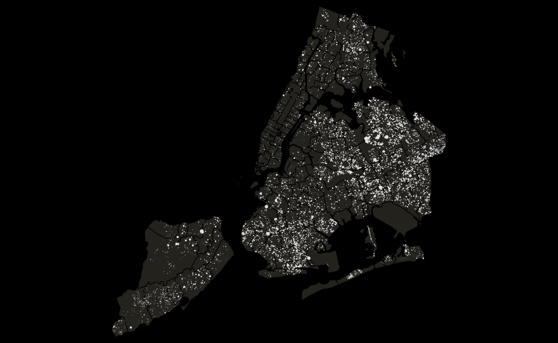 Lastly, the current map is still static. Making it interactive is something definitely worth doing. However, I would argue pubishing it online would be more valuable after most of the subjective manipulations being removed (by adding the observation data).
